
Home Aid
Brand Identity
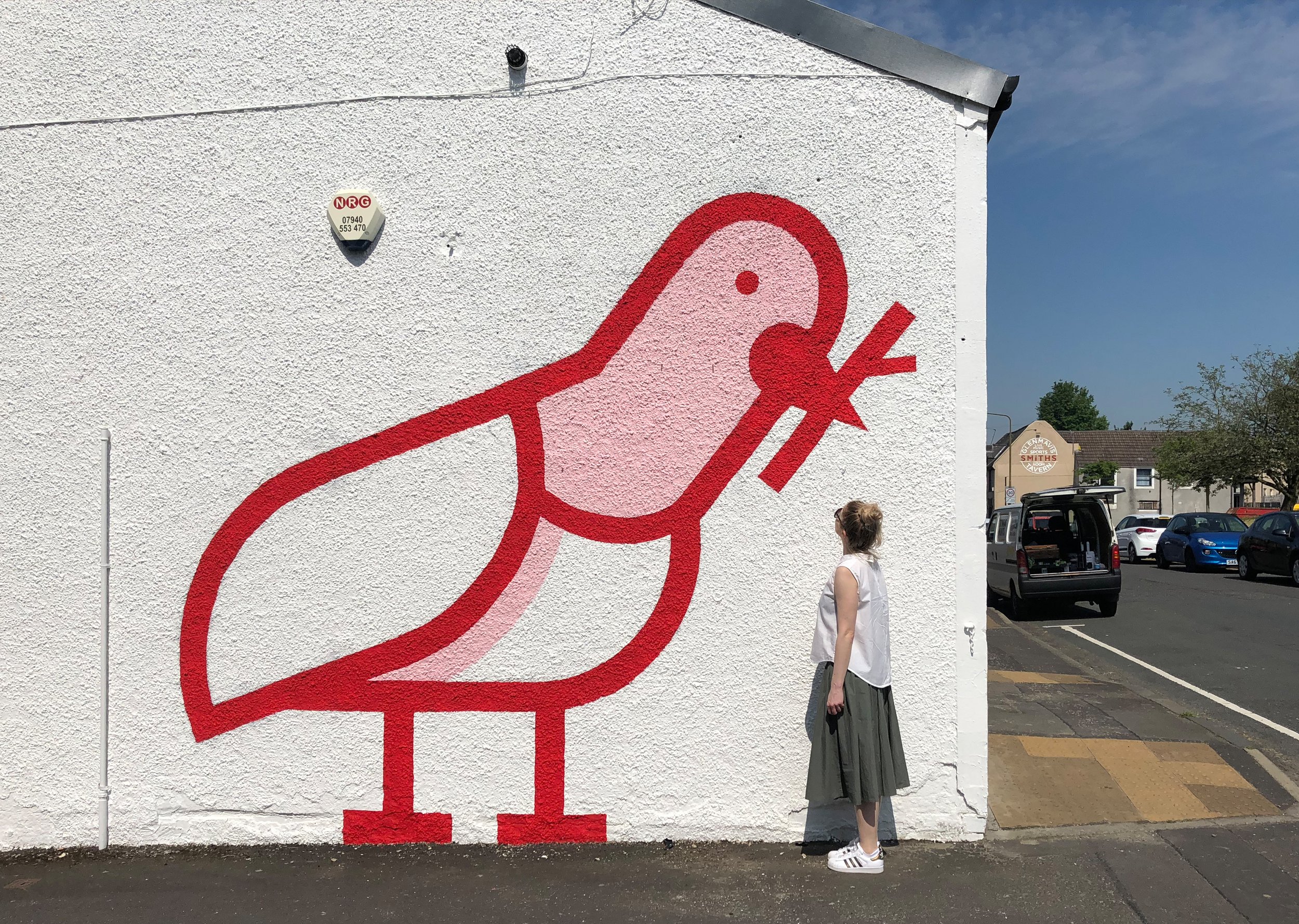
Sprucing up the nest
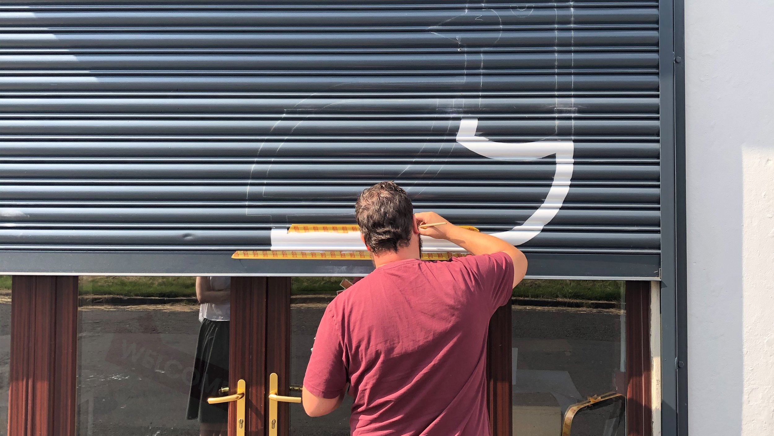
Home Aid, a cherished charity in Bathgate, has supported West Lothian’s vulnerable communities and championed furniture reuse for over 30 years. In 2019, we refreshed their brand to match their ambitions, starting with a workshop to engage staff and define the charity’s mission. The resulting visual identity features a pigeon-inspired design, symbolising home-building and sustainability. This identity, rolled out across marketing materials, signage, and shop interiors, has given Home Aid a recognisable, professional look that resonates with the local community.
Mural: Thomas PaintsPrevious Logo


"Working with DUO was a game-changer for Home Aid. They took the time to understand our mission and translated it into a brand identity that feels both fresh and familiar. Every step of the process was clear, collaborative, and genuinely exciting."
– Willie Dunn, CEO
If you have a project you’d like brought to life, please get in touch.